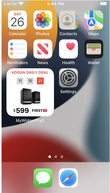
There’s never any rivalry between Mobile developers vs Web developers, right? Well, the intrigue of what happens in the (more exciting) mobile development space piqued the interest of our frontend and backend mates, so a few joined the Kogan Apps team along with our talented UX designer to tackle a project part of a recent Hack Day.
An idea was pitched to develop a Kogan widget for both iOS and Android devices. On any given day, we have multiple deals going on (see below for a screenshot from our website) but we narrowed it down to showcasing our popular ‘Kogan Daily Deal’ - complete with its own countdown timer to firstly, generate excitement and the sense that time is running out and secondly (and importantly in the world of eComm) to induce FOMO to prompt our users to purchase!
Divide and conquer! (How we started)
Consistent with Agile methodology, we created a backlog of tasks and divided them amongst our teammates. The web developers tackled the API, the mobile developers started their widgeting and UI/UX designed away.
We did manage to squeeze in a quick 101 for the web devs about the wonderful worlds of SwiftUI and JetPack Compose. WD1 (web developer one) tried to relate with how Angular, Vue or React works for the frontend, which is understandable and WD2 (web developer two) amused themselves with the discussion. It did come up later in conversation that WD2 had been a Mobile developer in the past and worked with Objective-C. Despite showing WD1 & 2 the cooler things that can be achieved with SwiftUI and Jetpack Compose, they remained unconverted - but hey, that’s their loss!
Henceforth, we will relay our learnings and achievements as conquerings!
Conquering #1
For a Mobile developer (MD) that creates the UI and writes code in either Swift/Objective-C or Kotlin/Java, they understand the pains of working with an Imperative Programming Language. However a WD or a frontend developer is blissfully unaware of these issues. They work with FlexBox and CSS, whereas a Mobile or Desktop developer has to work with making the UI as pixel perfect as the designer conceptualized. With a Declarative Programming paradigm like SwiftUI or Jetpack Compose, it makes it easier for our MDs to create the UI, similar to the ease of our teammates using FlexBox and CSS.
When the designs were completed, the next task was to compose the UI using Declarative. As we were waiting for WD1&2 to finish the API that would retrieve the Daily Deal data, static images were used as a placeholder.
Conquering #2
There was no API in the Kogan-verse to consume the Daily Deal data, so a handy bit of reverse engineering helped WD1 locate the data source such that they were able to create a wrapper to provide the necessary API endpoint that would return Daily Deal structure.
Matching the UI designs accurately on the Widget using SwiftUI was difficult! Where SwiftUI allows for composing new components quickly, it also has its fair share of quirks because the layout gave us some grief! We did end up getting the images to load, but getting the timer to tick away per the three boxed component design proved too challenging to hack on the one day.
Conquered
We completed the widget family for various sizes per the screenshots below. SwiftUI allows for previewing multiple views simultaneously.
Conquering #3
With SwiftUI or any framework, if we embed data into a scrollView, we have an instant list of multiple items that can be scrolled and viewed. We spent time trying to make scrollView work, only to realize that it crashes the code and SwiftUI does not provide a scrollView to a widget. So the List of Hot Deals had to be limited from a scrollable list to a list of 3 items.
Conquering #4
Making a lot of formatting functions and styles only highlighted that the designs could be improved. While we were working with a declarative way to create the components, having sizes that were fixed ranging from 11 to 22 points was not the best idea. In hindsight, we could have followed the Apple methodology to declare the styles, just like in CSS, and then apply a Heading, Body, type tag etc to an element rather than adhere to strict font sizes.
Conquering #5
In the designs there were places where the Price did not have decimals and places where the decimal place digits had a smaller font. This got complicated since the textbox that hosted “$479.75” needed to be split into the three components, “$”, “479” and “.75”, then they needed to be formatted accordingly. So similar to the TimerView above, and to make it customisable, we put a flag in to conditionally display the decimal points to work for both “$479.75” and “$599” type designs. Passing the font sizes and getting the decimal part of numbers is quite painful when dealing with computers storing numbers in 4 bytes. 0.99 would become 0.9900000000000000001 or 1.00 would become 1 and not have any trailing zeros. Our Javascript friends could use strings to take the characters around the decimal point. However we used Swift NumberFormatter to provide a minimum and maximum of 2 decimal places to ensure consistency, and used the suffix command to get the last 2 digits.
Finish
Our conquering process to develop a widget was an interesting one. Experimenting with the quirks of the language and technology enabled us to highlight learnings that were valuable and applicable to our day to day development work as Mobile engineers. And working alongside our WD friends harmoniously to achieve our goals, while showcasing to them the wonderful world of app development, is always a bonus. Onwards and upwards as we look forward to conquering the next hack day!


