Every month, our dev team hosts a "hack day" to explore creative ideas and learn new skills. This month, we focussed on building a custom module for our dashboard.
We've found our dashboard to be immensely valuable over the last 12 months and have spent a great deal of effort on adding to it and improving it.
Currently, our dashboard provides insights into all the important site health and infrastructure metrics, but not a lot is dedicated to monitoring customer behaviour.
My goal for this hack day was to build a display to visualise customer purchase behaviour across Australia. The idea was to overlay a heatmap of sales across a map, cycling through the last 24 hours of data.
The visualisation was partly inspired by the Bureau of Meteorology's national weather radar loop.
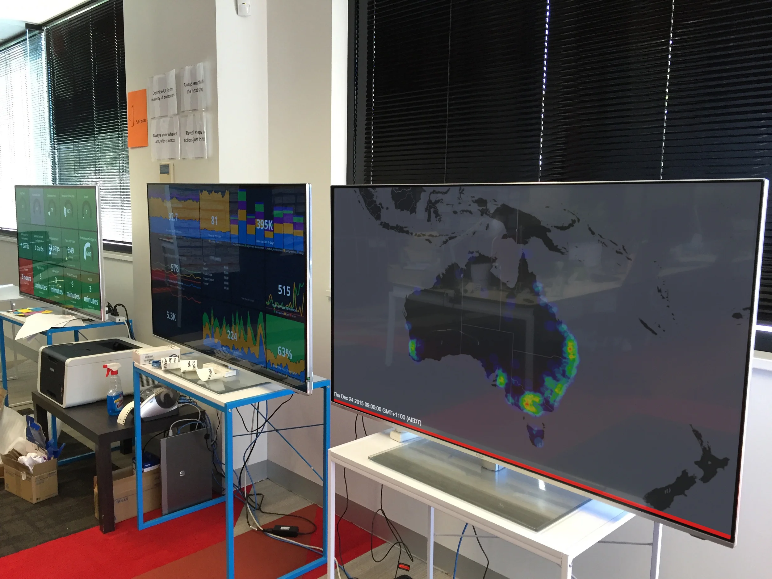
The new dashboard
How we built it
It's always a challenge to co-ordinate a team working on a single product. There is always a risk of team members stepping on eachothers' toes, resulting in code rewrites and critical time lost.
To combat this, I split the team up to work on separate components, which meant communication was now more important than ever.
Each team was responsible for one component:
- Design and frontend dev.
- Sourcing live, aggregated sales data.
- Processing and feeding sales data to the frontend.
Prior to commencing development, we sketched out several ideas until we had an agreed vision. Then the real work began.

The final dashboard mockup
To start with the data, we grouped the number of hourly sales by postcode, and mapped them to lat/long co-ordinates.
For the map visualisation, we shortlisted two libraries:
LeafletJS was the standout because of its flexibility and plugin options.
What did we learn?
The insights from the visualisation didn't come as much of a surprise to our team.
The culture at Kogan.com is very deep-rooted in data and analytics, so the visualisation came close to our initial hypothesis.
- Majority of purchases are clustered in the major cities.
- Regional sales, which account for a high portion of total sales, appeared very thin when overlayed on a map.
I found that having the team work on separate components significantly reduced the need for rewrites. However, we cut it very close to the deadline, as we delivered functional prototypes throughout the day less frequently than desired.
A major takeaway is this project motivated the team to think about new ways of exploring our data for future hack days.
What's next
- Similar dashboard for page views
- Use Kibana to drill down further into the data